In episode 34 about customer feedback, I offered a free website review to three listeners of this podcast. One of them, Jose from hellospanish.co, has generously allowed me to share the critique publicly so that everyone can learn from it. Listen to the episode and check out the screenshots to get an idea of the visuals:
Highlights:
- Finding out what your brand’s specific strengths are, and crafting an intriguing homepage headline (2:07)
- Specific suggestions for getting more e-mail opt-ins (6:30)
- Comments on site layout, design, and speed (8:50)
- Clearly organizing your offers and products so that potential customers aren’t confused (12:14)
Tools:
Screenshots:
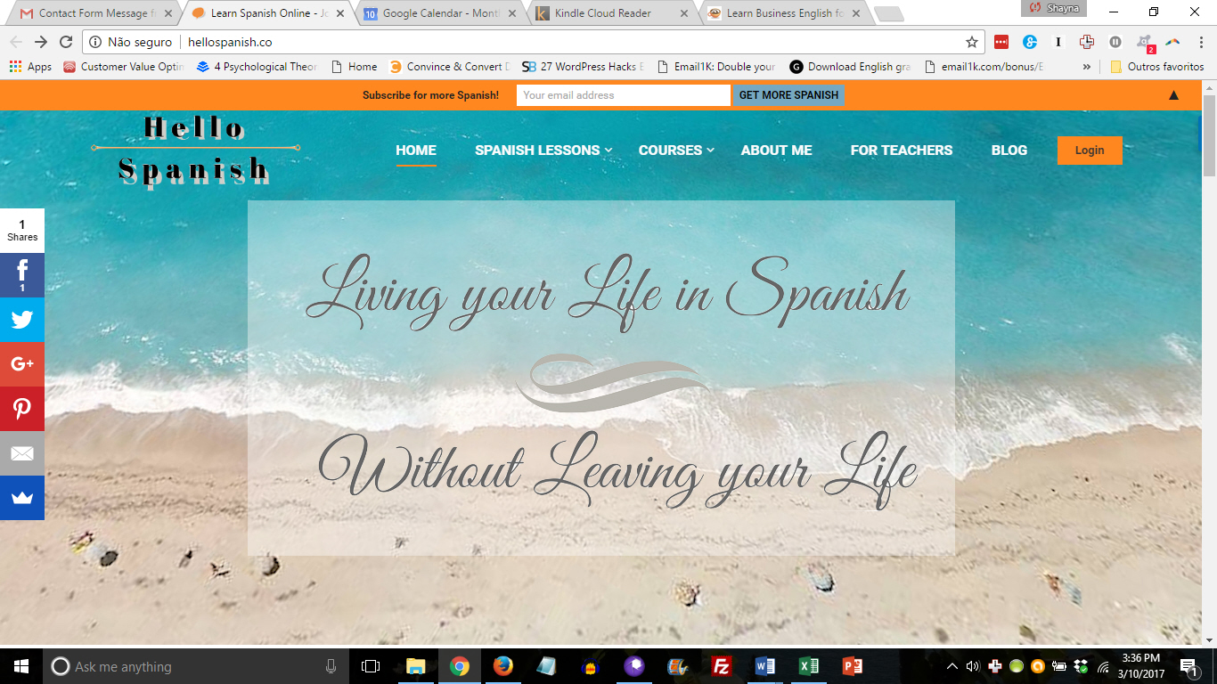
The tagline is catchy, but it’s not a realistic/natural value proposition. The e-mail opt-in bar could also be made more enticing through better wording and adding an opt-in gift.
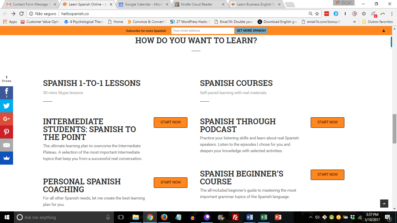
It’s hard to understand the difference between the various programs and offers. Also, I initially actually thought this was six items (not two categories each containing two items) due to the formatting.
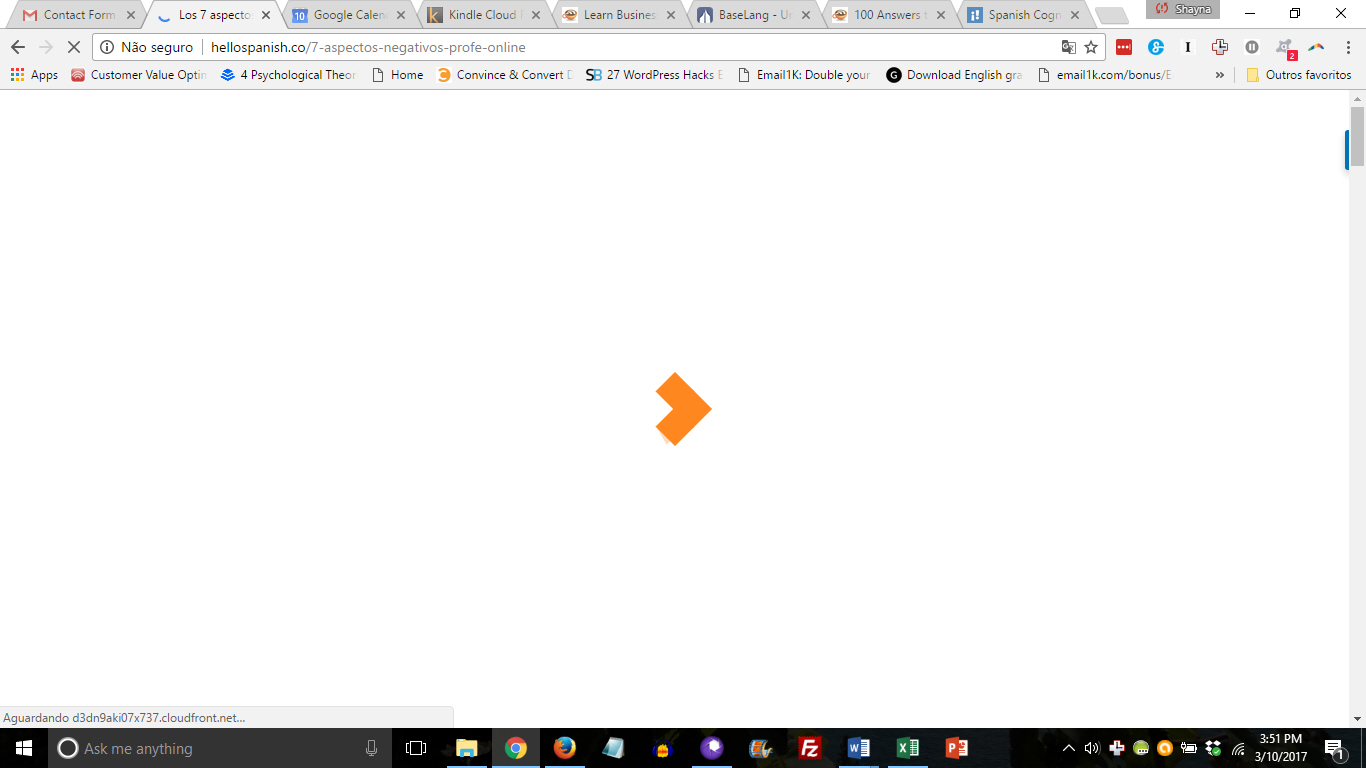
The site tests my patience; I often see this progress diamond while the page is loading. The website’s theme or the web host might be the culprit. Test your own site at http://tools.pingdom.com
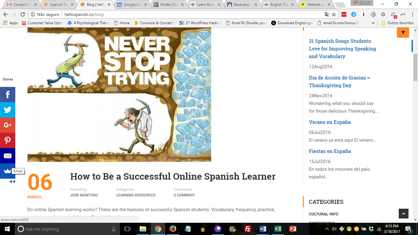
The blog images are huge, meaning I have to scroll a long way to get an overview of the various posts.
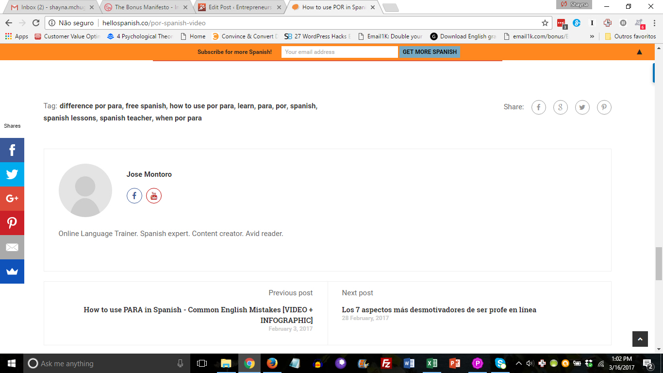
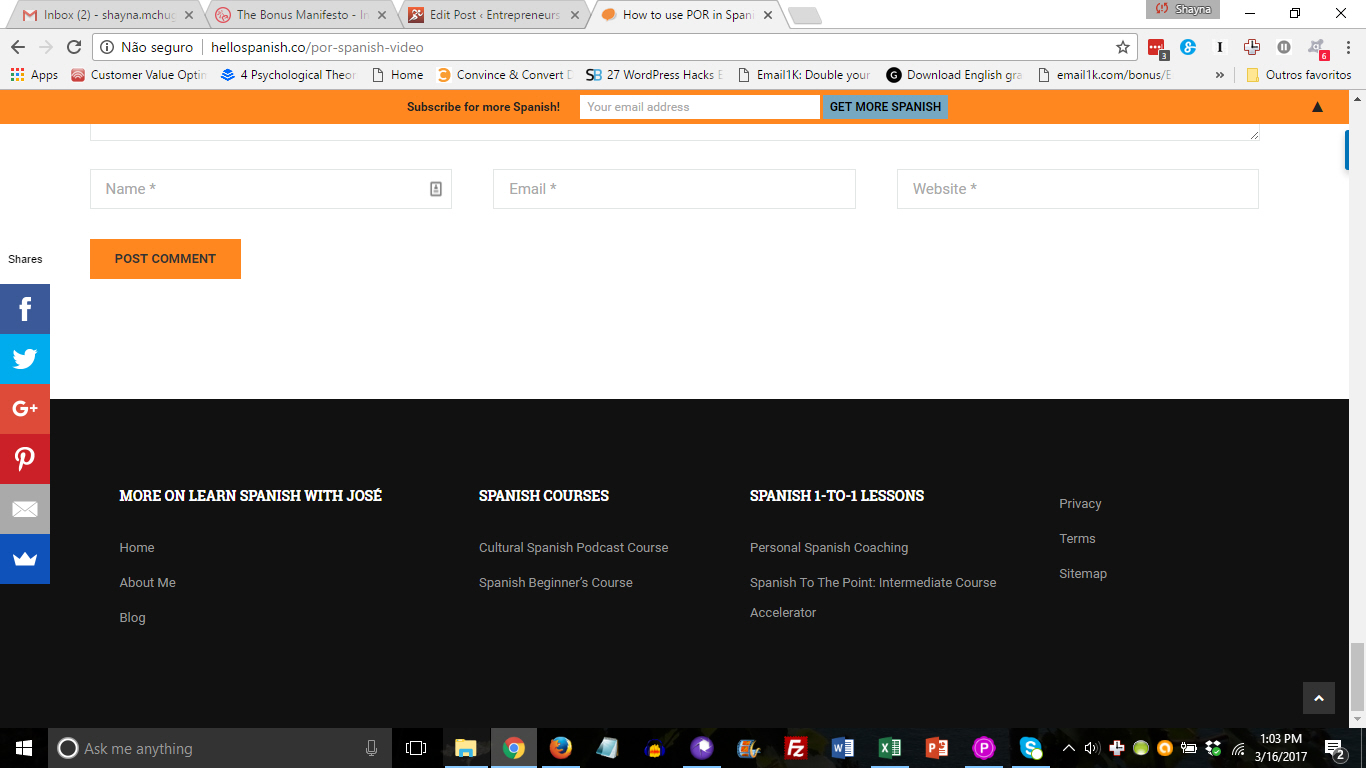
There is a LOT of stuff at the bottom of each blog post. In fact, it took me 3 screenshots to capture it all!
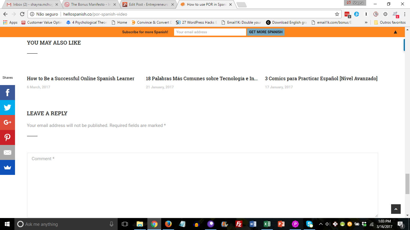
There aren’t many comments on the site, so I would suggest removing this functionality.
Too many options mean there’s no clear next action for the reader to take.


